Monday 30 October 2023

Being F**king Inappropriate

 Reflecting today on discussion group during my course workshop - it was a very rich session! We talked about what made art, and what helped to make art, and I said I needed (and enjoyed) creating an environment when I could be 'inappropriate', which I later expanded to 'being fucking inappropriate'. 

I wonder if this is a key to my art? Not being inappropriate in a childish way, but being inappropriate in a way that challenges norms and polite conventions of society? It feels like that the 'appropriate' behaviour after some of the things that I have happened to me is to be quiet, and calm, and polite... But actually, maybe my job is to separate 'art me' from 'real me', and turn up 'art me' to 11? Maybe 'art me' should tap into 'sales me'? Someone was shocked that I was pushing inauthenticity in this way - but maybe shocking is good? Maybe my job is to 'sell' the horrible things that have happened to me in a way that can help other people to face them, and other people to explore and share the terrible things that have happened to them? Maybe I should go from selling cloud computing to selling death? Maybe I am actually a performance artist?! Albeit one that shares their 'performance' only through the documentation of the images produced. Why am I limiting myself to only visual art? I am (I believe) pretty good at writing, maybe I should use whatever I can grasp to share my message?

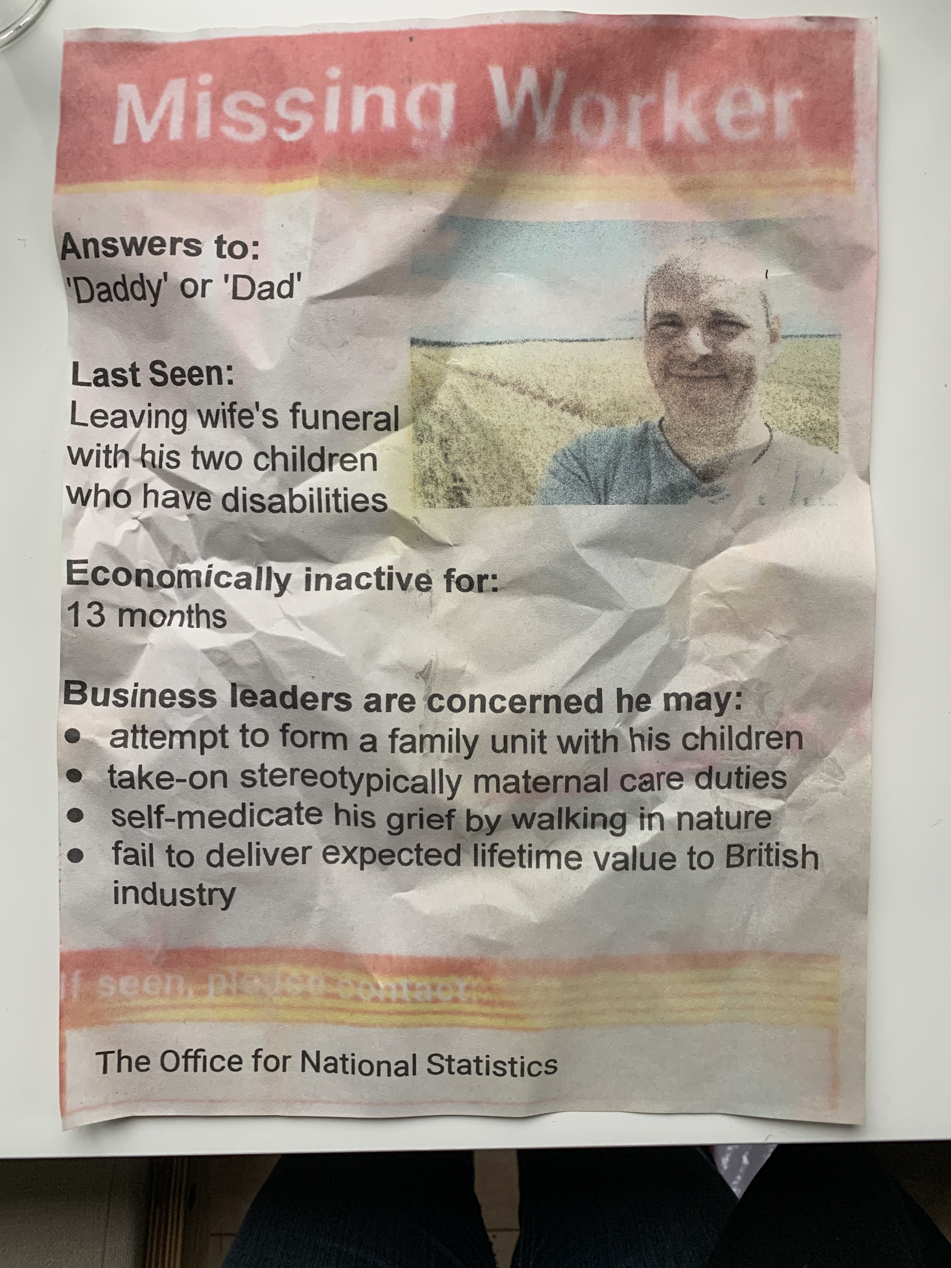
I think one of my strengths is humour, and I have always used humour to convey and soften tough ideas and situations. Maybe I should be making fucking inappropriate art that is also compassionate and humorous in whatever is the most expedient and effective medium/process? I don't consider my 'Missing Worker' poster to be particularly challenging or brave, but it's been interesting and lovely to see people react on LinkedIn to it in those ways - so many kind words and admiration at my sharing something so personal.

If I truly believe that the process and the medium are just a means to an end, should my MA focus on the technology? Or the rather the ideas? Can I settle long enough on one set of ideas to actually make it the subject of the next two years? Is my personal experience too narrow a subject to share?!

Saturday 28 October 2023

Art as Process or Production? Chance, will, and the definition of success

 Leading on from the last blog (yes it was an emotionally tiring 3 hours!), another student shared an interesting comment that I am still struggling with: am I in danger of moving from 'process' to 'production'? I.e. am I moving from focusing on the process of making art, to the outcome. I find this deeply troubling, and need to explore it further in my mind and in my practice. My retort was "but I care about the outcome, not the process", and I had assumed that wouldn't be controversial. However, there is clearly a strong school of thought that the process is what counts, and that meaning and value will follow - the process is what we control, and how can we create original art if we have a fixed outcome in mind.

I need to discuss this with my tutor, the idea that art is about outcomes is fundamental to me - for me, it's self-expression from the mind, not self-expression from the body. I am starting to see that this is not a mainstream view, but giving up on it feels very wrong. Of course the destination is influenced by the process - my art rarely turns out exactly the way I envisaged, but the idea of relinquishing control feels too like play, and with an outsiders perspective, feels like introspection of the worst type. If there are no rules, how can the game be played? If there are no outcomes, is art just throwing shit against the wall and hoping it makes a shape that other people value?

Why do I make art?

 Until last week I would say "because I have to, it's a compulsion", which is a slightly glib answer, and one my 'sales' persona would be pleased with. I've had some interesting and difficult conversations in the last week, 'difficult' in a good way. Something another student shared reminded me why I started making art, and of a quote from the psychotherapist, Carl Rogers:

Yet there is, I believe, a much more important reason for my writing. It seems to me that I am still -- inside -- the shy boy who found communication very difficult in interpersonal situations: who wrote love letters that were more eloquent than his direct expressions of love; who expressed himself freely in high school themes, but felt himself too "odd" to say the same things in class. That boy is still very much part of me. Writing is my way of communicating with a world to which, in a very real sense, I feel I do not quite belong. I wish very much to be understood, but I don't expect to be. Writing is the message I seal in the bottle and cast into the sea. My astonishment is that people on an enormous number of beaches - psychological and geographical - have found the bottles and discovered that the messages speak to them. So I continue to write.

I am in danger of making art because I want to be successful, because I want to be able to identify as 'an artist', because I want people to say 'wow'. That is not healthy, for me, or my art. I started making art as a means of self-expression, to share with others the fact that I have a secret inner world, that I am a world in myself, not just a puppet of flesh. The other student also pointed out that a lot of my art is very vulnerable - it opens up a place that a lot of people would rather hide, or pretend doesn't exist. I think I need to take heed and lean into that. I need to reclaim 'success' and I think it needs to be that I create art, and that my art engages others - in which there is a fair amount of 'traditional' success to unpack - it implies my art needs some sort of audience and platform, for instance.


Tuesday 24 October 2023

Significance, Ascetics, and Technicalities

 I was thinking about my "burn together" picture, and about my problem with the smoke, and I suddenly remembered that I hadn't intended to have smoke at all. I had made a deliberate choice to avoid smoke because smoke implies destruction of the thing on fire. The 'decision' to add smoke was driven by the desire to make the fire look more 'fire-like'. Reflecting on this, made me think that there are three forces governing the form each element takes, broadly in order of importance:

  • Technical: What is the medium capable of? In this case, what constraints does Blender place on fire simulations... But it could equally be the constraints of working in watercolour, or the limitations of carving stone
  • Ascetic: Does it engage the viewer? Does it look right? Is it 'readable'?
  • Significant: Does it convey meaning to the viewer? Does it convey the self-expression of the artist?
As I am working, I need to keep these three elements in balance, knowing they are all inter-related, but that (for me) significance is most important, followed by ascetics, and constrained by technicalities.

Monday 23 October 2023

Applied for "In Between Gallery" Open Call

 Decided to practice submitting to exhibitions, so applied to the In Between Gallery Open Call for photographic-based artists to have their work exhibited on a huge window in Brighton. Modified "Britain 2050" to work in 4:3 ratio:

And wrote my first bio:

Tom Grey is a digital artist, based in Kent, UK. His practice focuses on exploring new ways to apply technology to art, and the balance between control (the intent of the artist) and chance (the will of the medium). He uses and blends diverse technical tools to achieve his work, including procedural generation, 3d rendering, photographic manipulation, and generative artificial intelligence. His work explores themes of loss, resilience, and the emotions attached to spaces and objects.

Tom is currently studying a Masters in Digital Fine Art at Central St Martins in London. Prior to the death of his wife in 2022, he worked as a technology leader at companies including Google, IBM, and WPP. Outside of his studies, he is a full-time carer to his two amazing children, who have disabilities. He walks every day, and is inspired by the patterns and chance that he finds in nature.

I have zero expectation of getting accepted, but it's a good fire-and-forget exercise, and who knows...


Sunday 22 October 2023

Let's Burn Together Fire Simulation (Project queue = 1)

Let's Burn Together is a piece I have been working on, on-and-off, for a while. It is intended to feature a couple, on a bench, covered in flame but apparently unconcerned. Fire in my work represents grief, but also defiant resilience in the spirit of "burn it all down". From a practice point-of-view, the image has been a great chance to better understand fire simulation and fire shaders, but doing so has made for slow progress! The fire simulation has proved problematic, slow to process, and even buggy, but Saturday was about getting it sorted again... The people were initial modelled and posed as low resolution meshes, which where also used as inflow objects for the simulation (inflow object is crudely the thing that's on fire!). After some experimentation, the figures were replaced by volume objects based on the meshes, which made them much less distinct, but smoother and more in keeping with the fire. The simulation has been difficult, but has been improved by adding wind so the flames billow away from the figures, and by tweaking the noise and vorticity. The best frame was chosen, and 'frozen' by extracting the Open DB volume and re-importing it as static volume object. Unfortunately, doing so appears to have broken the blackbody radiation settings:

As a result, the smoke is being rendered like colder flames, and the flames themselves are super-boring looking with no detail! Sunday night means I've have had a beer, so I might not get much done... but the aim would be to sort out the shader for the flames, plus tweak the shader for the people, to hopefully get something that looks great.

Friday 20 October 2023

The risk of experimentation in digital vs physical art

 This week we were encouraged to take a risk and try something that doesn't work. I think I try stuff that doesn't work all the time - my pictures are a series of little failures and little successes... So why it is a big deal for some? I think perhaps

  • I am still very 'young' in my artistic practice, so less comfortable, less at risk, less exposed... I have time and space and no real agenda yet except to explore... It reminds me of the great quote from Handiwork by Sara Baume‘Amateurs’…have their own convoluted, inefficient and superfluous processes of production that reflect their subjectivity and freedom from the obligation to produce a defined output. 
  • Experimenting in digital art is MUCH easier (to me) than physical art - when I don't like something, I can remove it again in a couple of clicks... And restore if just as quickly (assuming I set things up correctly!). Whereas with paint, each stroke takes it's toll on the overall image - you can't afford to screw-up... With code and with digital art generally, you can screw-up as much as you like, knowing you can just put it all back...

Thursday 19 October 2023

More 'secrets' and a Flyer of the Bill of Health Exhibition (project queue 1->2->1)

Exciting news... There's many a slip between cup and lip, but it looks like I will have my 'Missing Worker' poster included in the Bill of Health exhibition at Central St Martins! Very excited if it happens because I have never had anything exhibited before! I spent some interesting time speaking to the person who is curating, coming up with some good ways to show the poster. I also volunteered to create a flyer based on the poster. I eventually came up with this - which I am mostly happy with:

I'm really pleased with the weathering effect - I wasn't sure how I was going to do it, but ended up creating two almost transparent copies which I blurred and added noise to, the offset downwards. I also added fake stains, and used an almost transparent noise texture to make the paper looked crinkled. I'm much less happy with the stickers - it was a good idea to use fake pharmacy stickers, but I think they should probably be under the noise so they look less flat.

I initially went down the route of using a real photo of a copy that the curator has left in her garden, but it looked too crinkled for the labels to look even remotely convincing:

Lesson learnt was not to rush, and not to settle... 

Did a bit more to the bottles in Secrets, but mostly just tinkering:

I don't know if the process is slow, or I'm slow... I think a bit of both - I'm slow because I'm distracted, and the process is slow because the shaders for the liquid take work, and the wax simulation takes time and energy to set-up.

Monday 16 October 2023

Martyred Root aka "What a scorcher: Britain 2050" done... Maybe? (project queue= 2->1)

 Recognising this phase now, where the piece keeps being finish... then not finished... then finished again... then wrong... then finished... 

I think I am there... I've added a couple of elements - a lizard which I think it really needed to lift the image and inject a bit of life, and a newspaper, which I am much less sure of (too obvious? not clear what it is?) but which seems to work really nicely, and also give direction to the satire of the image (otherwise the only real clue-in is the title).

So I think this is it! 

Better post it to Insta before I change my mind... I'll hold off posting to LinkedIn until things are quieter in Israel I think :(

Friday 13 October 2023

Adding more bottles and some dubious substances to secrets (project queue=2)

 Decided to have a break from my root(!) last night while I let the almost-done image marinade in my head... So back to 'secrets'... Made some good progress - I improved the cork texture from terrible to merely 'meh', I put some more realistic blistering into the label and added text, and I modelled a new bottle containing an unnamed cloudy white liquid... 

Mostly happy... I need to start thinking about some shelves for these puppies... Which begs the question of "What sort of shelves?"... Kitchen shelves? Lab shelves? Garden shelves? I was thinking it needs to be a fairly organic location to match the bees that I want to add (did I say I want to add bees?) and I starting thinking (out of nowhere?!) about suitcases and carry cases and I love the sense of portability since you carry secrets around with you... But that does beg the question of what's around the suitcase so you can see it's a suitcase... Ahhh! Maybe OTHER suitcases?!

Posted my remastered famous paintings to LinkedIn, along with some slightly crunchy commentary... Let's see if anyone nibbles!

PS Decided I have more of a queue than a stack for my projects - nobody will ever care except me, but I want to dequeue them at random, not pop them in order...

Thursday 12 October 2023

Martyred Root coming together... (project stack = 2)

 Back on martyred root last night... Thinking I'll probably call it something like "What a scorcher: Britain 2050"... I'm very conscious of the conflict in Israel and the fact that this picture looks like a corpse in a sandy landscape :-/ 

The last iteration looked a bit empty, so I decided to add some more consumer 'crap' to the image. I found a very nice Starbucks cup (sorry guys), and added that... I tried adding car keys, but they were too small to see. The composition suffered, so I added more stuff - a wallet and credit card... I also cropped it down to make it easier to see these 'details':


I finished last night feeling pretty happy - I'd managed to stop the cup killing the composition (by reducing the amount of glare on it) and I'd got the wallet and credit cards to blend in... But actually my habit of emailing stuff to myself to examine in the cold light of day is important... This morning I'm wondering if I have overloaded it... I also had a sudden idea to add a message scratched into the sand - probably "what a scorcher" instead...

I am starting to feel this is dragging, but I'm also aware that that is a good sign - it means I'm nearly there and I'm into the painful but important details... I'll add the message tonight, and then experiment with hiding different objects and see what looks good - the great thing about digital art is that the wallet can disappear and reappear with a single mouse click, so I can afford to experiment and use judgement!

Tuesday 10 October 2023

Finishing AI Repaints Famous Pictures (project stack=3 -> 2 :-/ )

 And just to finish, I give you Van Gogh's Sunflowers (aka "post-impressionist oil painting of a half-yellow and half-white vase of sunflowers on a yellow table"):


Mr baseball cap seems to like it, at least... Posted to Insta, but will post to LinkedIn later in the week when my last post looses more traction.

AI Repaints Famous Pictures (project stack=3 :( )

 Everyone seems to think you just type what you want into gen AI and get amazing output... Firstly that's not true - there's a lot of work needed to get good outputs, and secondly (and crucially to me as an artist) - you may get good looking outputs, but it's very hard to control what that output looks like - if you want A picture of a curved bridge over a pond with waterlilies, go fill your boots... If you want Monet's picture of a curved bridge over a pond with waterlilies, it gets a lot harder... And if you want the specific bridge that is in your imagination... then it can be very frustrating to say the least...

So to try and prove a point, I thought it would be fun to describe a few famous pictures to Stable Diffusion, and see what it paints... The photoshop them back into the gallery - to try to give non-artists a taste of what it feels like when you don't get what you are expecting...

So far I've done "The Haywain" (aka ""painting of a horse and hay cart fording a river. a mill behind, a dog watching, open fields behind, trees, english countryside"):

And Monet's Waterlilies (aka "impressionist pastel picture of a curved white bridge over a pond filled with water lilies, willow trees on each side"):

Stable Diffusion does a better job than I expected, especially for the waterlilies... But I suspect it was trained on the latter, so maybe it's not a fair test... Nice bit of fun though. I should do a couple more, post something snarky on LinkedIn and get back to me root ;)


Monday 9 October 2023

Martyred Root WIP (project stack = 2)

 Plodding forward... Getting hard! Decided hair will be too much - a lot of work and then I'll realise it's not nice or subtle and bin it anyhow... So no hair, and if it screams out(!) for it later, I'll add some...

I've also decided to lean into the post-climate apocalypse theme... Added a broken mobile photo that looks like it has fallen from his hand, but which he also looks like he's reaching for. I was thinking of adding a family of mice and calling it something ironic like "Family Life: Britain 2050"... So I've spent a lot of time trying to find an image of a family of mice, or get AI to create one (with alternately hilarious and immensely frustrating results). However, I can't get what I want, mostly because it's very hard to get an image that matches the perspective closely enough not to look terrible... 

So I've decided to focus on just adding some tracks for now... And if that looks ok, I'll see if I can add some mice at the end of them... Decided to do the tracks as footprints scattered along a bezier curve in Inkscape, then exported that, imported it into GIMP and blurred it and made it slight translucent... 


I don't love it, but I don't hate it... And it's late so I'm going to call it a night and look again with fresh eyes tomorrow.

Friday 6 October 2023

Martyred Root directions and hair (project stack = 2)

 Early morning thoughts(!) for the hair... Interesting one because you could do it in any of three tools that I currently have in my toolbox:

  • GIMP would be easiest as it's where everything else is, and it has b-curves, BUT I'd have to draw each strand, and I'd need to work out the right 'fall' without computer assistance
  • Inkscape/Pycairo would allow me to position a few 'key' strands and generate a bunch more procedurally, but would mean extending my current pycairo code to allow a layer to be completely image based (i.e. to allow layers to be 'imported' in effect)
  • Blender wouldn't be a natural choice, but I've used it to extend 2D art before, plus I could model the head crudely and let Blender do some of the work of calculating 'fall', and the emitter would mean I wouldn't need to code... but it would give me less control, and would mean faffing about with Holdout shaders and swapping between Blender and GIMP
Plan - try Blender first as it gives me the most control and assistance to start... Especially as I don't even know if I want the hair...

Future directions... It's just a bit of fun, with no 'a priori meaning' that I can discern (although it does remind me of my 'sinking into the earth' metaphor for grief in 'Awaiting Spring')... So I could:
  • Keep it open by just posting it as it is as a slightly sad, slightly spooky, picture for Halloween, playing on the fact that our 'fears' and sometimes just pieces of root...
  • Lean into the environmental vibes I get - after the Anthropocene - with perhaps a smashed phone (or some other consumer trinket) and some animal tracks positions in a sort of f**k-you-your-time-is-over way
  • Lean into the grief theme above in some way e.g. pick out the (now largely hidden) wedding ring that's on my hand in the photo I graphed on to the arm
I'll probably play with the environmental theme first and see if it looks moving, thought-provoking, or just cheesy!

First thing in the morning as I'm waking up is a very productive time to ponder this stuff and generate ideas.

Martyred Root WIP (project stack = 2)

 Having some fun in GIMP... Created and saved a mask that isolates the 'figure' and then up'ed the contrast and down'ed the brightness so he stands out (wonder why he's a 'he'?). Searched the internet for a good hand but nothing... Then went to generative AI... for a HAND... So that was a sh*t show... So then took a photo of my own hand. Imported it, cropped it, played with the colour, positioned on the end of the 'arm' and used the eraser to make it look buried, and the clone tool to pick-up some texture from the rest of the 'arm'... Also copied the entire body, flipped it, positioned it and tried to remove material so it looks like it's more deeply buried. The edges left by the eraser look quite smooth, not like the jagged edges of the real root... I wonder if there is a way to replicate that in GIMP? Using a layer as a selection maybe?

Looking pretty good so far (although probably less so at high resolution... I wonder if an AI based upscaler might fix that?). Tomorrow I want to try adding some very subtle wisps of hair using pycairo - mostly to gross people out!

Martyred Root (project stack = 2)

 I really shouldn't stack any more projects, but I can't resist having a play with this 'found object' - spotted out walking with my daughter on the local heath:


Obviously it's a tree root, but it looks like a desiccated body half buried face-down in the sand! At first I took a pic because it was cool, but I'm thinking it could be fun (and a new direction/approach) to see if I can enhance the image so it's clear that it's a root, but also clearly a body too... A bit like the "AI day dreams" I did using image2image, but this time just using GIMP/code...

Let's melt some virtual wax... (Project stack=1)

 Currently working on "secrets". I want the bottles to be sealed with wax. Trying to use metablobs seems painful, but a liquid simulation seems overkill... But after a lot of frustration, I've gone with the latter. Making sure the 'viscosity' is ticked is important or it all just runs off ;) I start with a cylinder of 'wax' as a geometry flow object, just above the cork. After some trimming of the 'drips', and mindful the neck of the bottle is a terrible shape for this (too much overhang), I'm pretty pleased:


That cork texture makes me want to be sick into my mouth though.. So I'll clean that up, and try modelling some different bottle shapes.

Thoughts in car home:

  • Liquids should look somewhat biological
  • Could mess about with other spaces and materials too e.g. silver mirrored liquid, 'lumps' etc
  • Initials and dates and/or places and dates
  • Do not use real people or dates (life is too short and it's a shitty thing to do)
  • Have some 'sets' of bottles e.g. 3 identical bottles with dates a few days apart
  • Definitely embed everything in a bees nest, but where should it all sit? Shelves? A box? Something else?! Definitely meaning and interest to be had there too...

Thursday 5 October 2023

Created my first post

 This is really a test, but yes, I did create my first blog post. If you are unsure, you can confirm because you are reading it. I'm hoping my next post will have actual content.